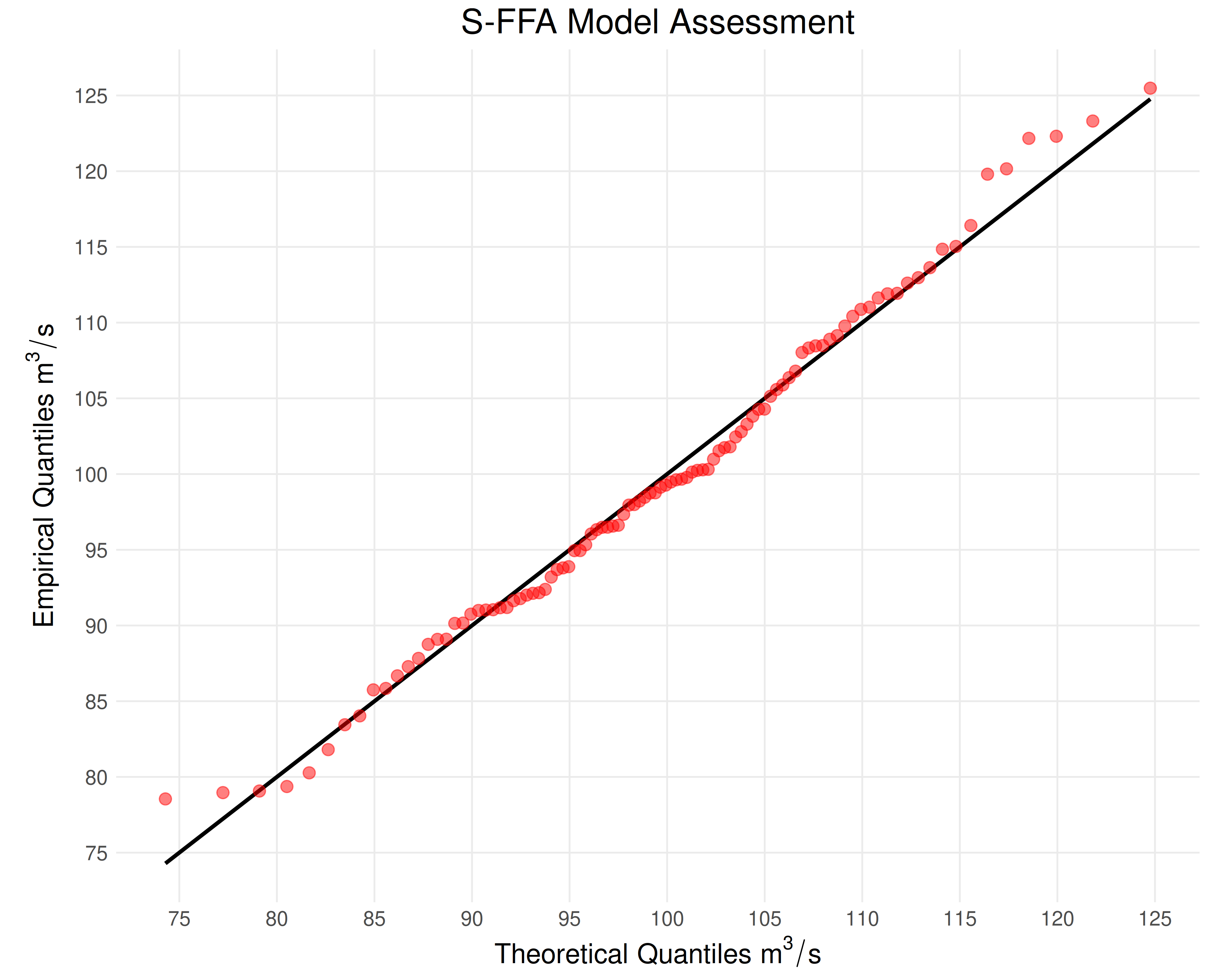
Creates a quantile–quantile plot comparing observed annual maximum series data to quantile estimates from a fitted parametric model. The 1:1 line is drawn in black and the parametric model estimates are plotted as semi‐transparent red points.
Arguments
- results
List; model assessment results generated by
model_assessment().- ...
Optional named arguments: 'title', 'xlabel', and 'ylabel'.
Value
ggplot; a plot containing:
A black line representing a model with no deviation from the empirical quantiles.
Red points denoting the estimated quantiles against the empirical quantiles.
Examples
# Initialize example data
data <- rnorm(n = 100, mean = 100, sd = 10)

# Evaluate model diagnostics
results <- model_assessment(data, "NOR", "L-moments")

# Generate a model assessment plot
plot_sffa_assessment(results)