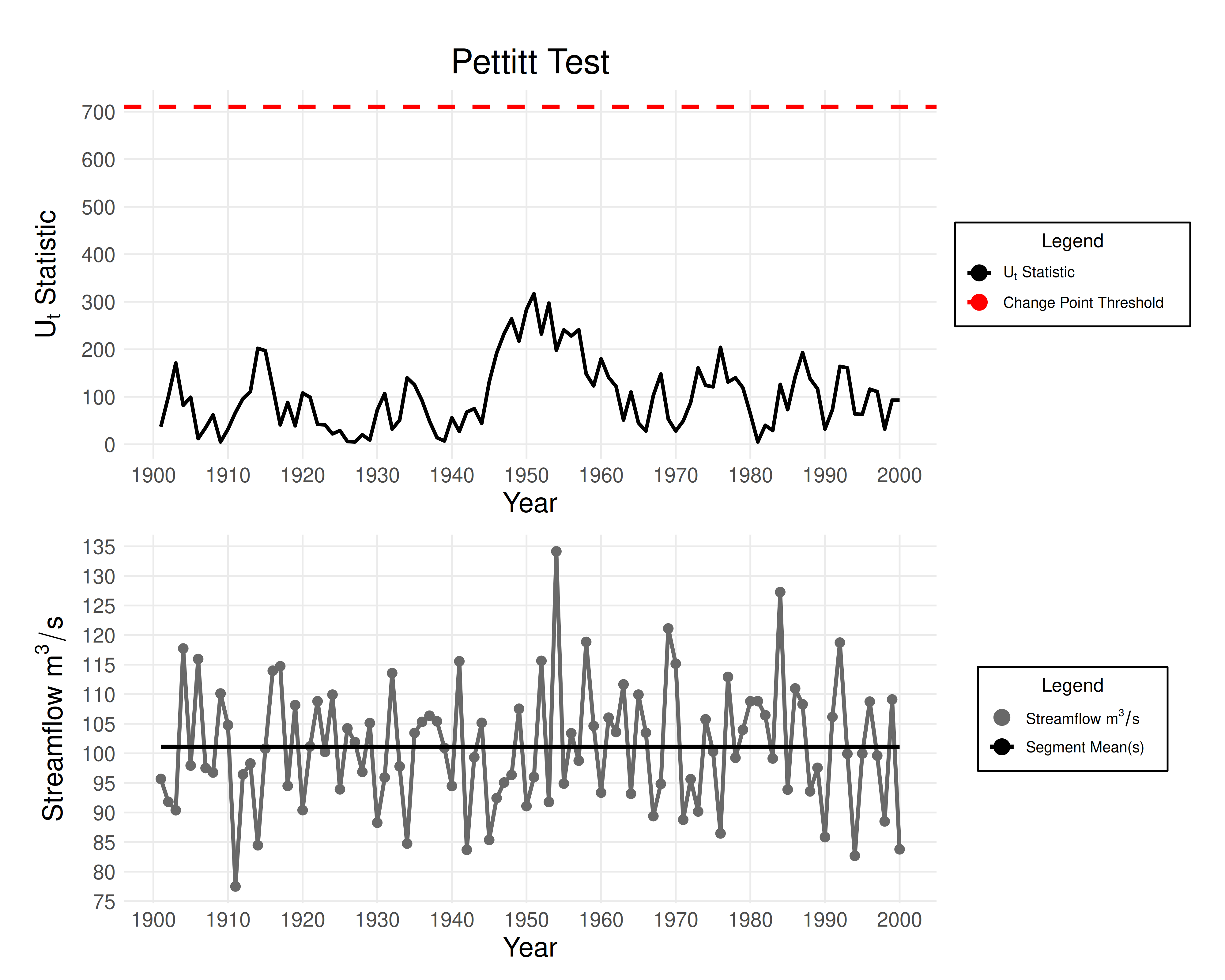
Creates a two‐panel visualization of the Mann–Whitney–Pettitt test. The upper panel plots the Pettitt \(U_t\) statistic over time along with the significance threshold and potential change point. The lower panel displays the annual maximum series data with an optional trend line, the period mean(s), and potential change point(s).
Arguments
- results
A list generated by
eda_pettitt_test().- show_line
If
TRUE(default), draw a fitted line through the data.- ...
Optional named arguments: 'title', 'top_xlabel', 'top_ylabel', 'bottom_xlabel' and 'bottom_ylabel'.
Examples
data <- rnorm(n = 100, mean = 100, sd = 10)
years <- seq(from = 1901, to = 2000)
results <- eda_pettitt_test(data, years)
plot_pettitt_test(results)