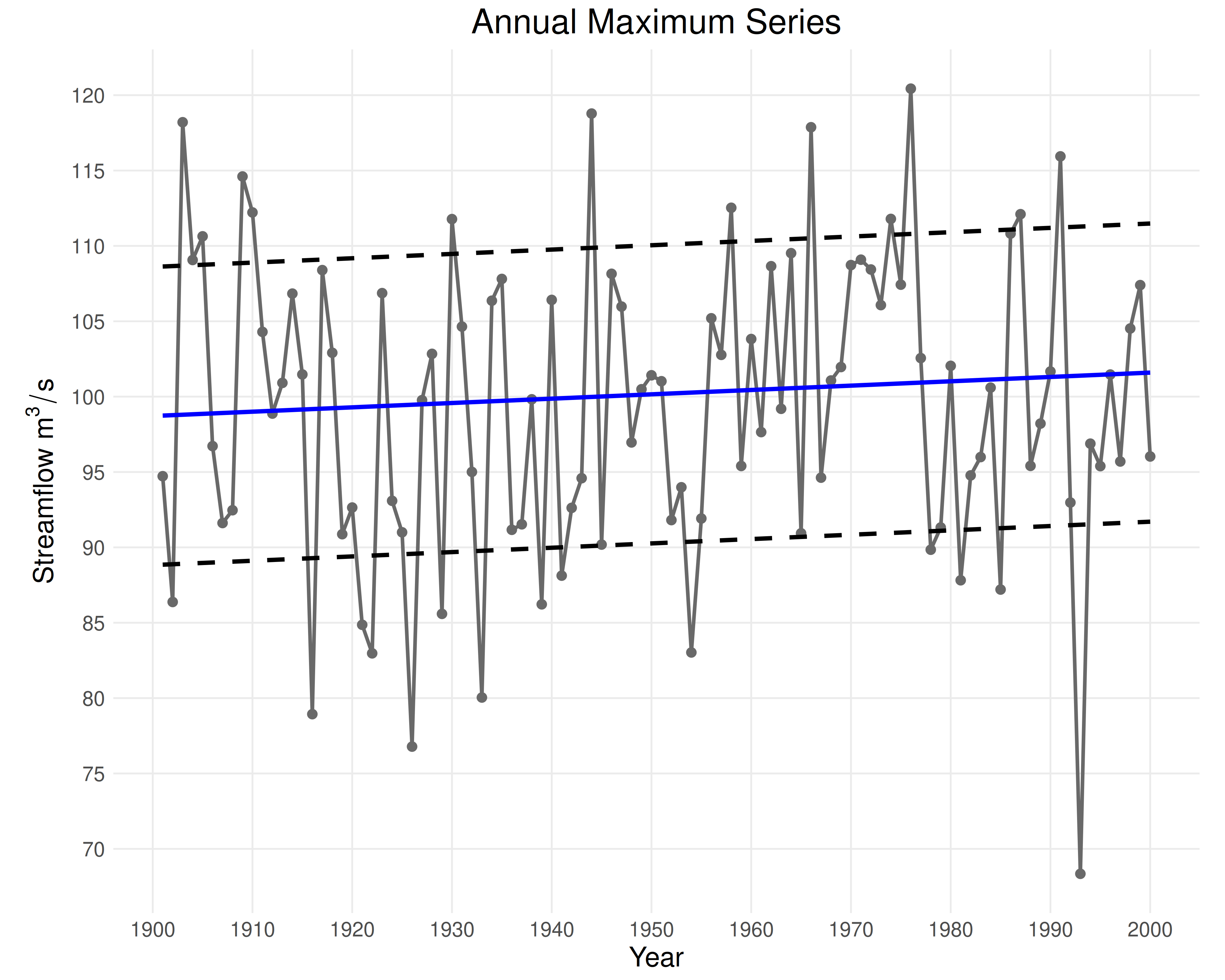
Produces a scatterplot of annual maximum series data against time, optionally overlaid with the sample mean/variability or Sen's trend estimator of the mean/variability.
Usage
plot_ams_data(
  data,
  years,
  plot_mean = "None",
  plot_variability = "None",
  show_line = TRUE,
  ...
)
Arguments
- data
Numeric vector of observed annual maximum series values. Must be strictly positive, finite, and not missing.
- years
Numeric vector of observation years corresponding to
data. Must be the same length asdataand strictly increasing.- plot_mean
If "None" (default), the mean will not be plotted. If
"Constant", a black line is plotted at the sample mean. If"Trend", the trend in the mean is estimated usingeda_sens_trend()and plotted as a blue line.- plot_variability
If "None" (default), the variability will not be plotted. If
"Constant", dashed black lines are plotted at one standard deviation above/below the sample mean. If"Trend", the trend in variability is estimated withdata_mw_variability()andeda_sens_trend()and plotted as a dashed blue line.- show_line
If
TRUE(default), a fitted line is drawn through the data.- ...
Optional named arguments: 'title', 'xlabel', and 'ylabel'.
Value
ggplot; a plot containing:
Gray points for each year’s annual maximum series value.
A gray line connecting the data if
show_line = TRUE.A solid black line representing a constant mean, if
plot_mean == "Constant".A solid blue line representing a trend in the mean, if
plot_mean == "Trend".A dashed black line representing constant variability, if
plot_variability == "Constant".A dashed blue line representing a trend in variability, if
plot_variability == "Trend".